When creating a hotel website, it's valuable to seek inspiration from other websites.
The appearance of a hotel's website is the first point of contact with potential customers, and the way rooms are presented is a crucial element that can determine whether they choose to book or look elsewhere.
Creating an attractive room card is central to receiving more online bookings since typically, visiting this page is the last step a customer takes before finalizing a reservation.
We consider that there are four essential elements to take into account:
1. Design: the design of room cards should align with the overall website and reflect the hotel's personality. You can opt for an elegant and clean design with light colors, or go for a more modern and comfortable look with darker shades. You might even experiment with a retro or futuristic style.
2. Information: clarity and accessibility of information are crucial. Customers should have no doubts about the room's capacity or included services.
3. Easy Booking: the booking bar should be prominently visible and easily accessible to potential customers.
4. Impact of Images: the choice and arrangement of images significantly influence the decision to book. Ensure you select high-quality images that highlight the room's strengths.
But, how can you find inspiration to create original and engaging designs? Examining the design of other hotel websites can be an excellent starting point. You'll find many options to draw inspiration from to personalize your page.
Here are 10 ideas that have impressed us, not only for their original design but also for the exceptional user experience they offer, simplifying navigation and booking for guests.
Coclee Suite Palace (Lecce)

This is an example of a symmetrical room detail page with a Parallax Scrolling effect. The image gallery on the left takes up half the space and the description takes up the other half.
The elegant font chosen for this room card captivates attention, with its large characters ensuring that both images and text hold equal importance.
The Reservation button is located at the middle of the page, being visible but not intrusive.
Hotel Cap Rocat (Mallorca)

The room detail page reminds of the colors of sand and nature, so that the potential customer feels the impact of the natural environment surrounding the hotel just by seeing the web.
The soft and gentle colors create a sense of radiance and warmth. The interplay between captivating photos and enchanting narratives, written in the style of ancient tales, adds an air of mystique and allure to the room card.
The booking bar is large, located at the bottom of the page.
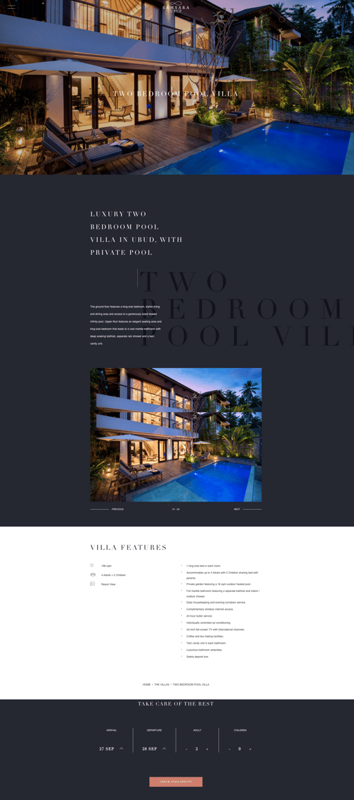
Samsara (Ubud)

In contrast to the previous page, here the predominant colors are dark, nocturnal ones.
This room card conveys a feeling of privacy and elegance.
The style is modern, some of the texts overlap, and the movement of the elements gives an idea of mystery. Despite this, the features of the room are presented clearly and specifically.
As in the previous option, the booking bar is located at the end of the page.
Stanford Court (San Francisco)

We move to a slightly simpler, futuristic web.
The room detail page is simpler than the previous ones, but impacts by using bright colors in some elements, such as the background of the features.
Also in this case, the reservation button is located at the middle of the page, between text and features.
Mas d'En Bruno (Priorat)

Let's get back to light and bright colors with this room card from the mas D'en Bruno hotel.
Aside from the text and image carousel, the most interesting element of this page is the presentation of the room features in a very visual way.
The layout of the text and the use of symbols highlights each feature.
As the previous option, the reservation button is located at the middle of the page, between text and features.
Can Lluïssó (Mallorca)

The Can Lluïssó room card is a modern, light-toned option in which photos predominate over text.
This option places a strong emphasis on the visual elements, highlighting the importance of captivating images. The booking button is strategically positioned right after the main description, ensuring its visibility and accessibility to potential customers.
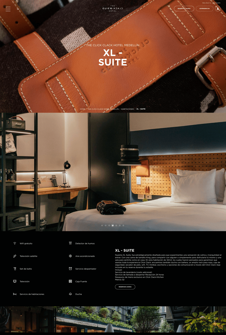
Click Clack Hotel (Medellin)

The room page of the Click clack hotel incorporates many elements in a reduced space: a photo carousel that takes up the entire screen, followed by the description and visual presentation of features.
The dark tone has a different impact than the Samsara hotel in Ubud; there is no feeling of mystery, but of modernity and originality.
Hotel Zaza Austin (Austin)

Hotel Zaza's room page exudes a sleek and contemporary vibe, perfectly reflecting the hotel's overall style. The presentation of information is both visually appealing and easy to comprehend, with a well-organized layout that follows a geometrically design. In this example, the contact form and booking button are strategically highlighted, ensuring maximum visibility and accessibility for potential guests.
In many hotel webpages the room cards are displayed in the same page, one below the other in a simpler way. We propose 2 distinctive and creative options that you can take into account in creating your personal design.
Hotel Ryans (Ibiza)

Not all hotel webpages aim to convey an image of relaxation and elegance. Ryans Hotel has a very creative and original website that captures the essence of fun and vibrancy.
In this example, they used the Parallax Scrolling effect, the description inside a label remains fixed while scrolling the images.
Hotel Mongibello (Ibiza)

Mongibello hotel features a simple and nostalgic room page with a touch of vintage aesthetics.
The colors are retro and each photo seems to have an opacifying veil effect. The room card maintains a clean and minimalist layout, consisting of a photo carousel and a concise description. The standout element is the vibrant red booking button, adding a pop of color to the overall design.
There is much more inspiration out there, but we trust these ideas have helped you find inspiration for creating original room cards. Keep in mind that every establishment has its own digital experience needs, so tailor your designs accordingly.