In the ever-evolving landscape of the hospitality industry, where digital experiences play a crucial role in attracting and retaining guests, the success of a webpage in engaging and maintaining new customers relies on a combination of aesthetic and strategic choices.
We have identified a key page element that significantly influences the increase or decrease in direct bookings: the booking mask. Despite often being perceived as a secondary element in website design, it should not be overlooked. In fact, it deserves the same level of care and attention as other sections of the page.
In this article, we delve into the world of booking masks, which are intricately woven into the design of hotel websites, not just as aesthetic elements but as strategic tools.
Including a booking bar on the homepage of a website offers numerous benefits compared to a basic 'booking' button.
One of the key advantages of having a booking mask is that it enables customers to select their desired dates for booking before being redirected to the booking engine. This prevents them from having to search for availability on the current date, which often leads to disappointment with no available results.
Furthermore, guests familiar with searching for accommodations on popular OTAs (online travel agencies) like Booking.com or Expedia will find it more convenient to use a similar search method to find available rooms.
In addition to having the booking mask on the homepage for customers who are ready to book, it is also beneficial to include a booking mask on the room details page and offer pages. This allows customers to be directed straight to the specific room or offer they are interested in, making the booking process even more convenient and seamless.
Still not convinced? We're not just referring to the typical, mundane rectangular booking bar that sits at the top of the page. In this article, we aim to inspire you with a variety of booking mask styles, providing you with several ideas to help you choose the perfect template for your web page.
It is essential to keep in mind that the booking masks, along with the other components of the webpage, must be mobile-friendly, necessitating the adaptation of their style to suit various device sizes.
As a result of a thorough online search, we have carefully selected websites that have implemented innovative and optimal solutions to incorporate a booking mask on their pages.
These captivating examples of booking masks are sure to inspire you.
In the Home Page
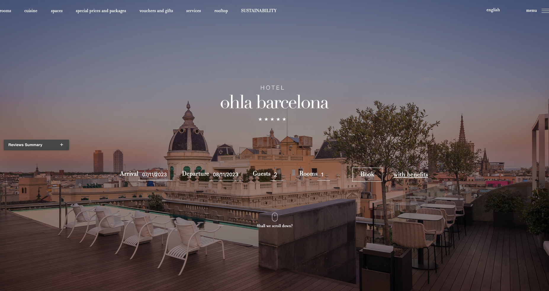
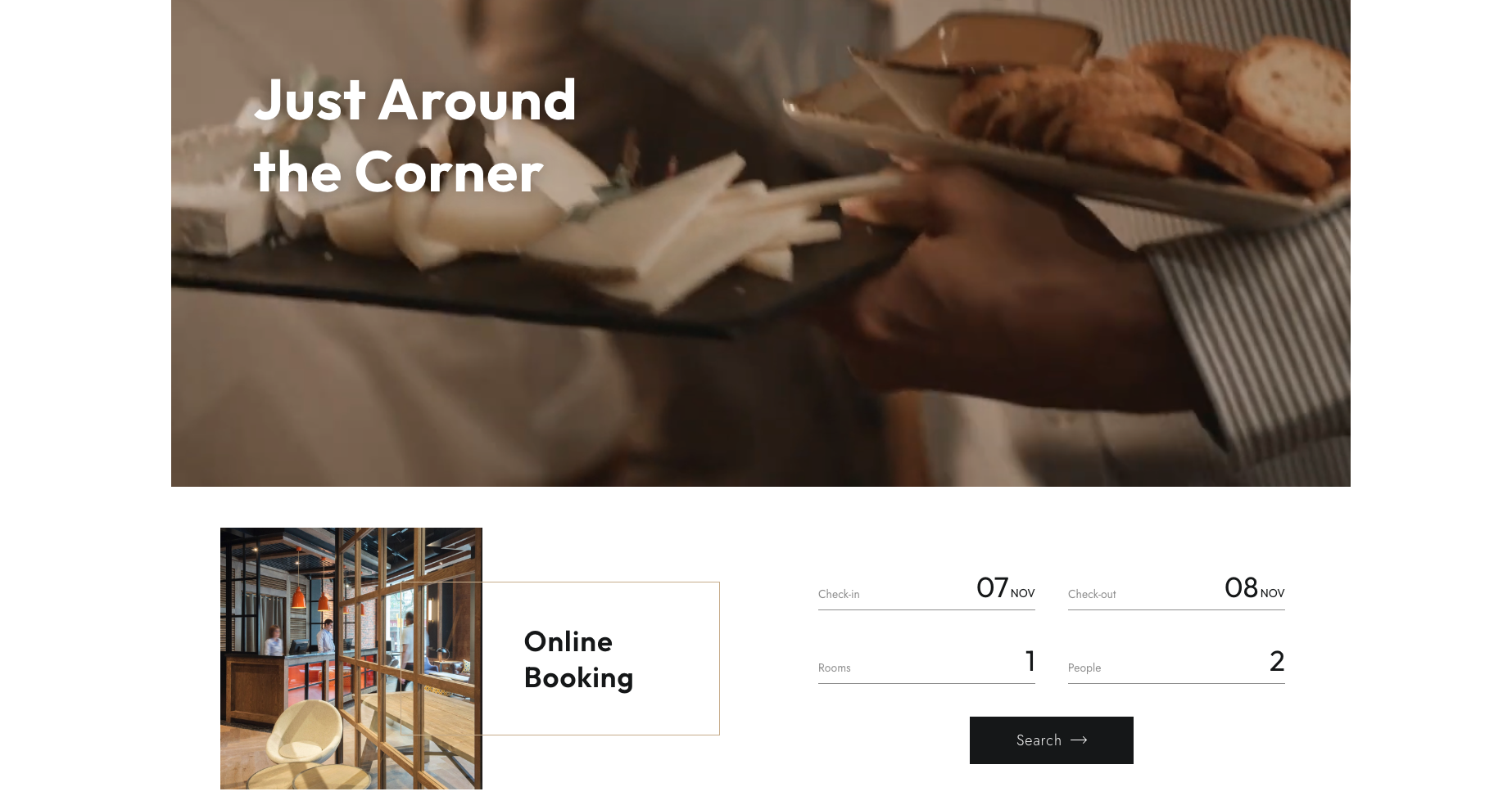
In the main image or slider
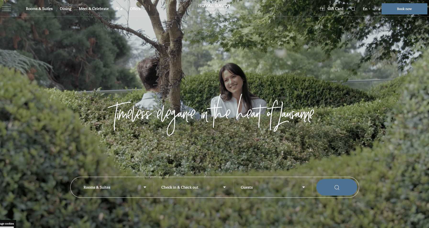
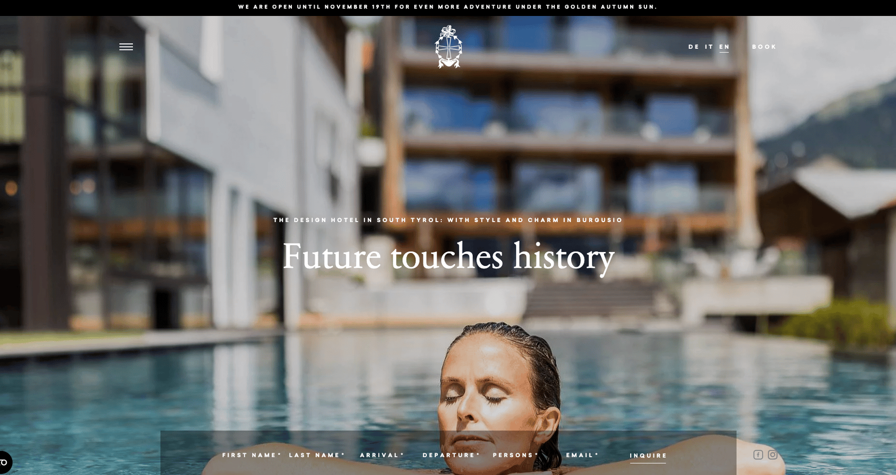
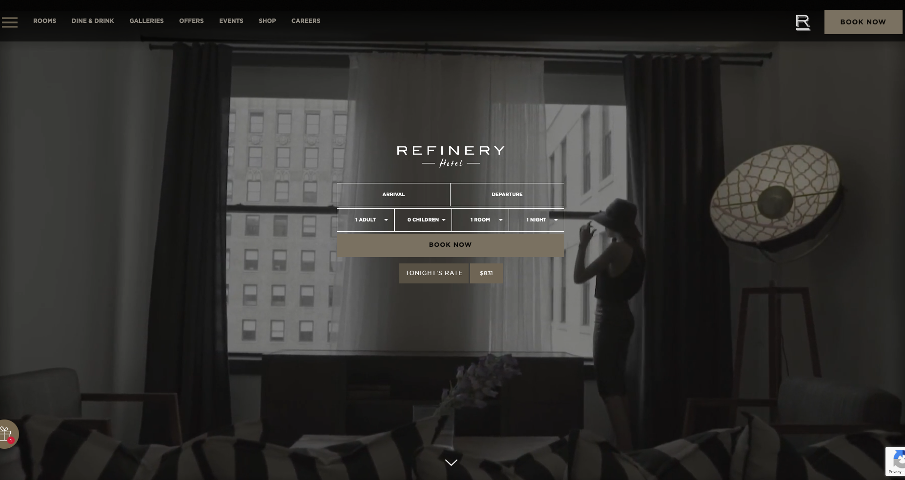
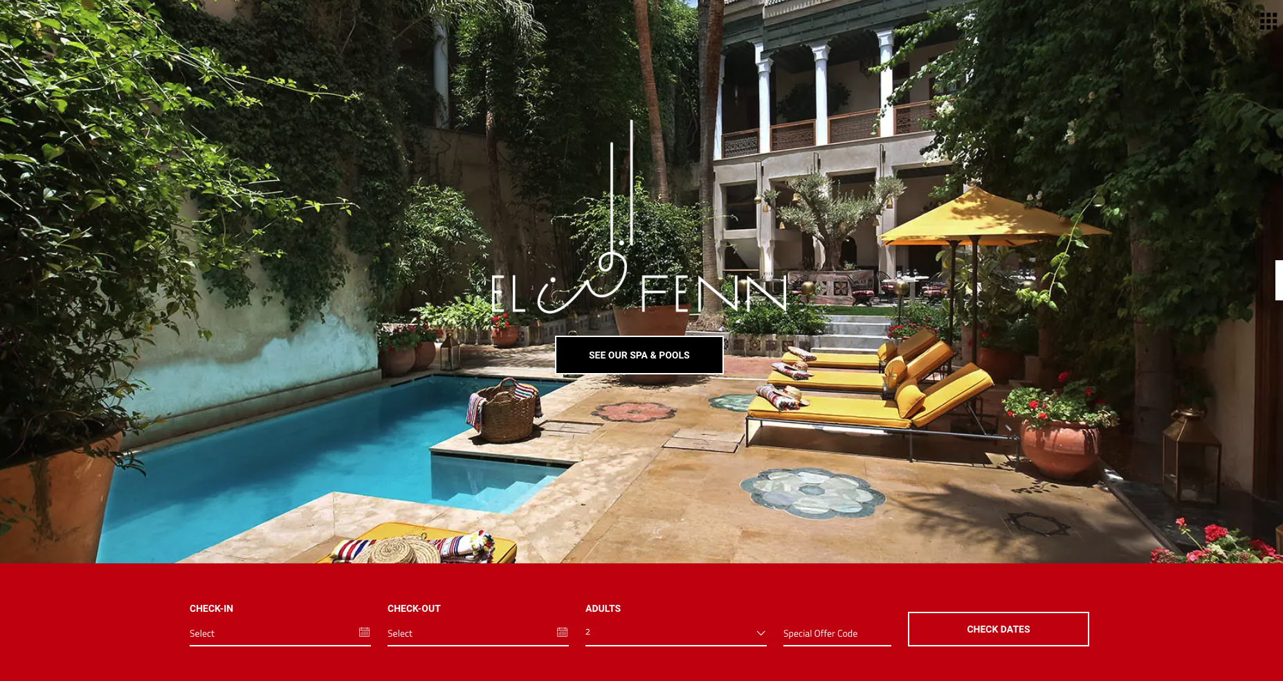
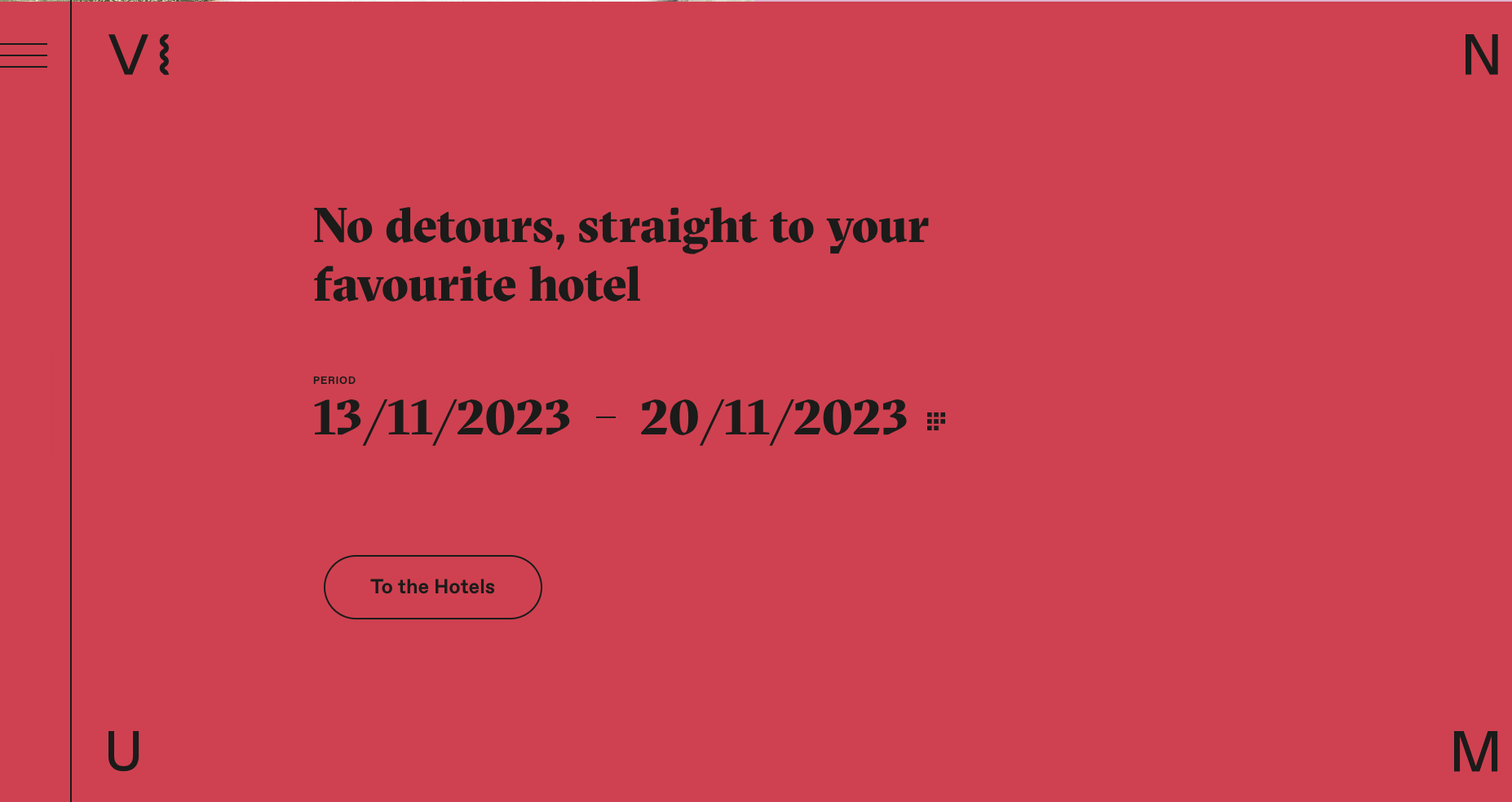
In a color block in the body of the page
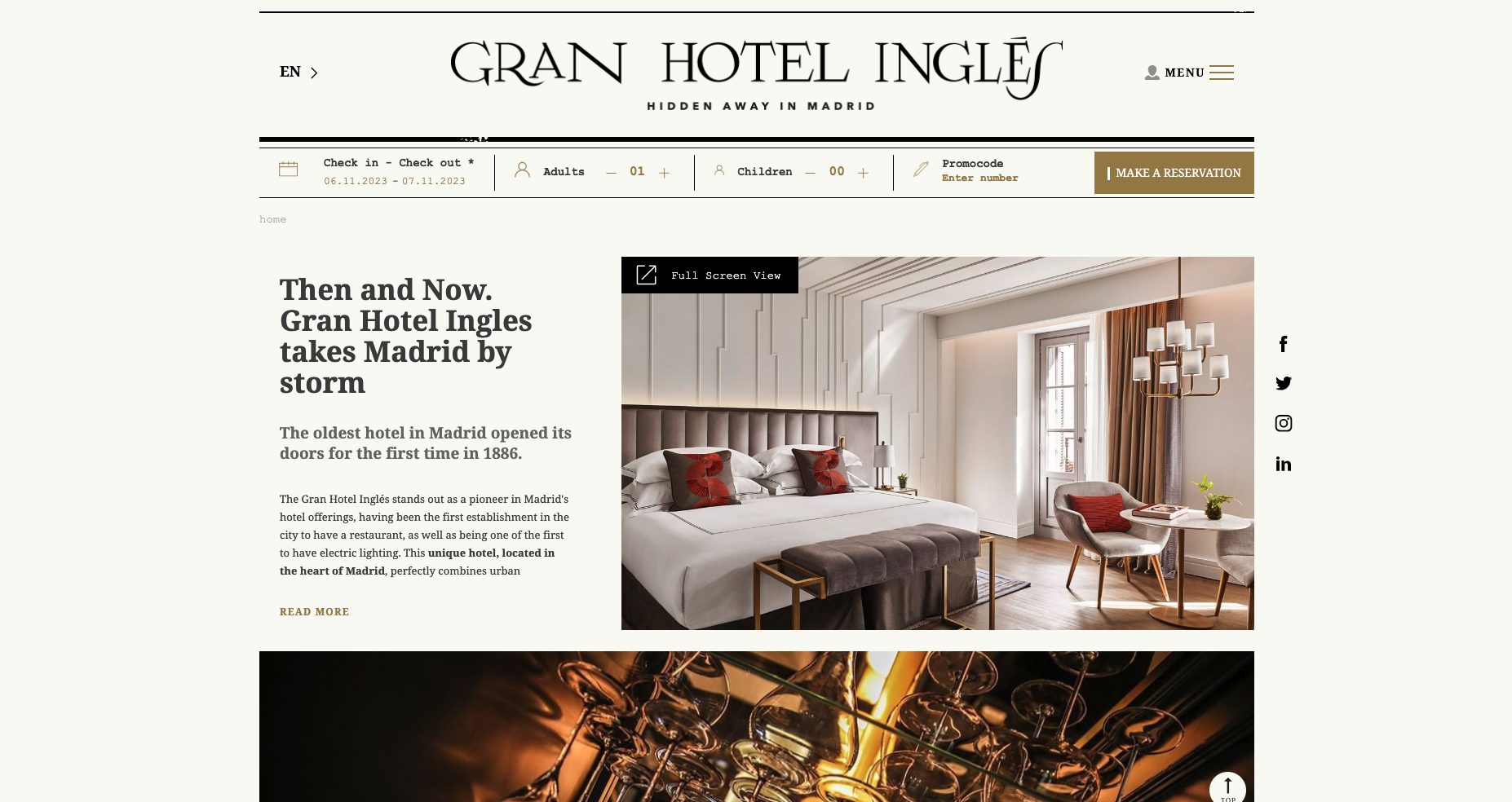
Fixed at the top of every page, displayed in the header
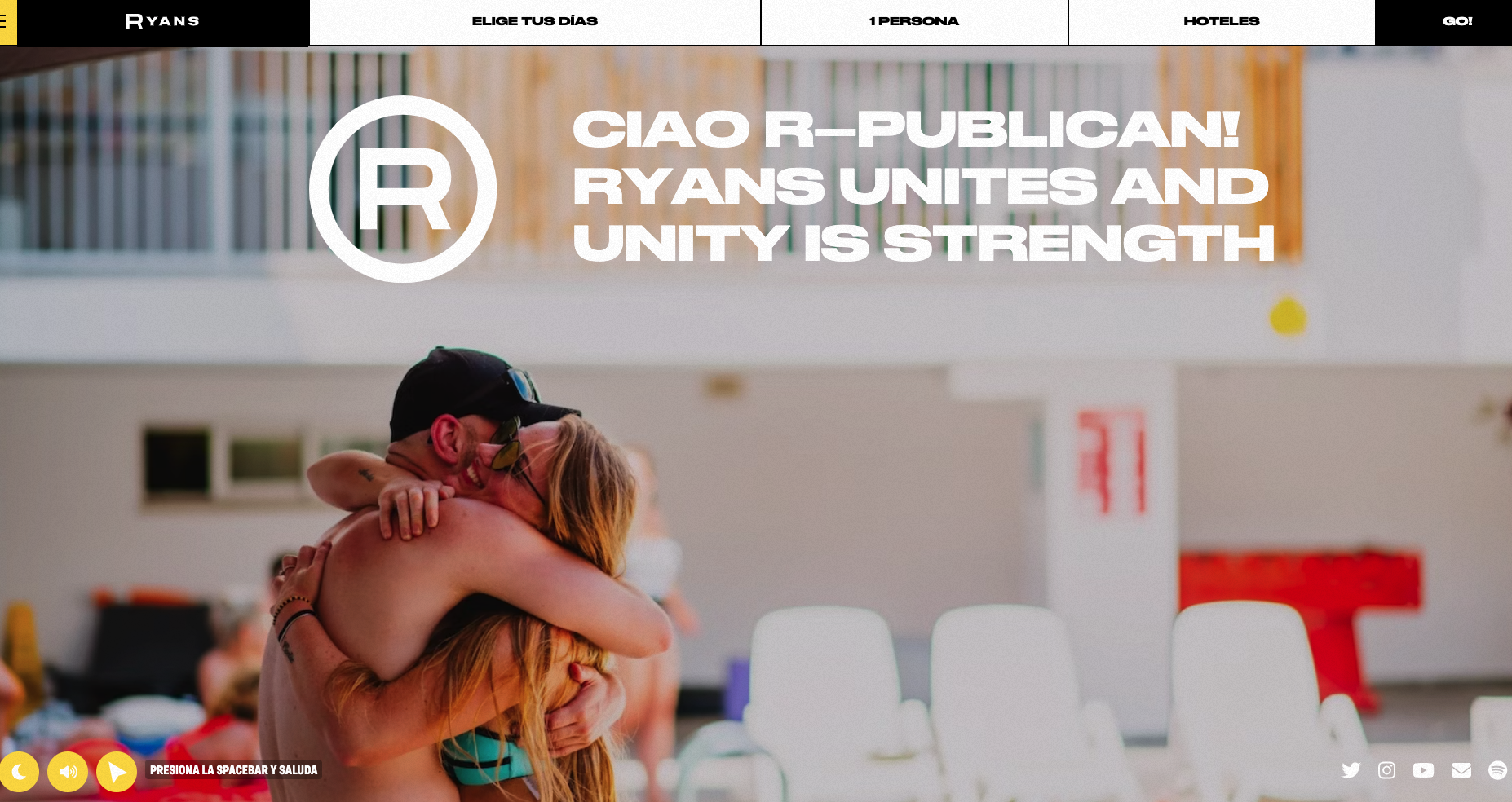
Fixed at the bottom, providing a constant presence on every page
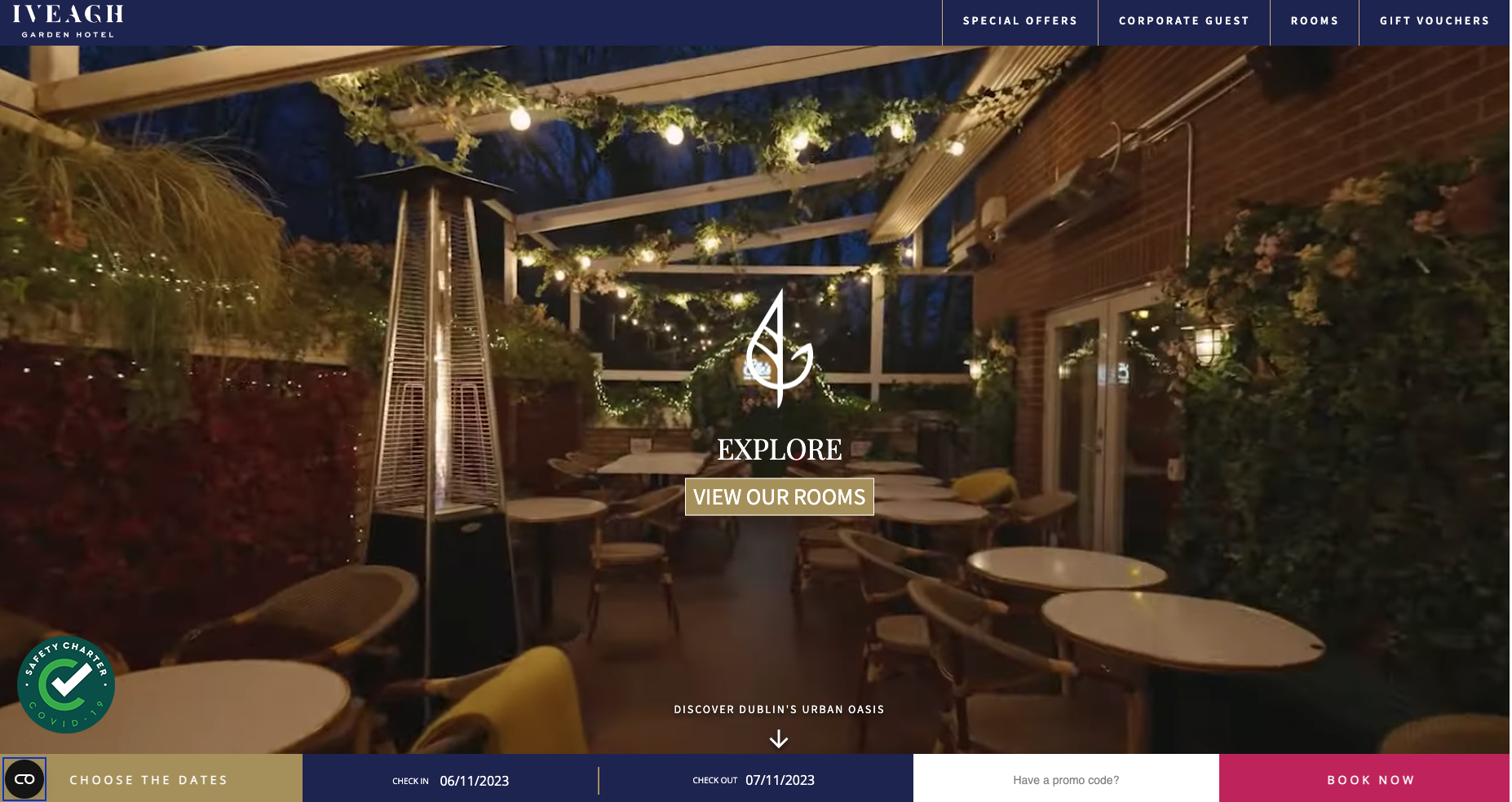
Placed discreetly in a corner, either at the top or bottom of the page
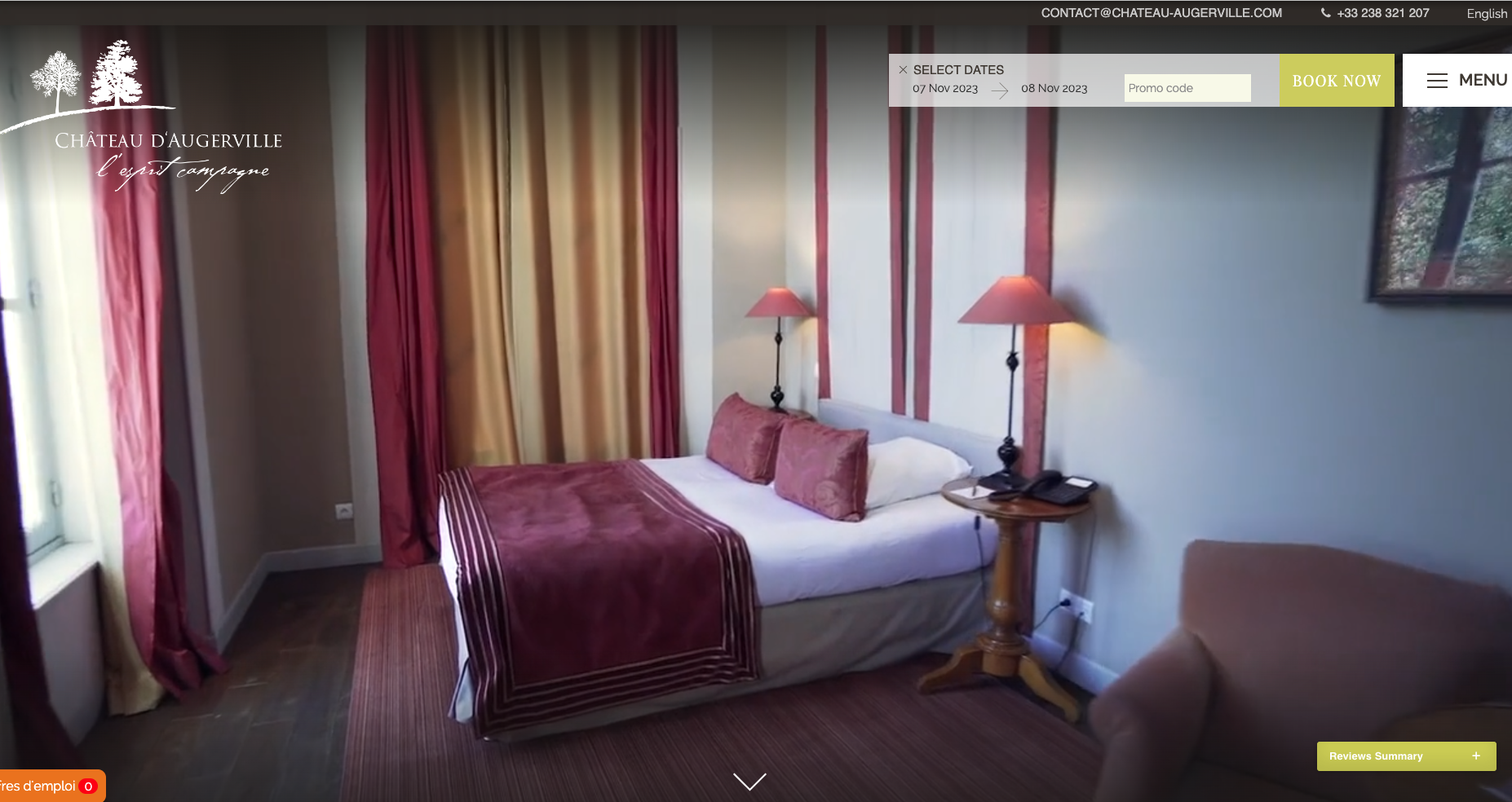
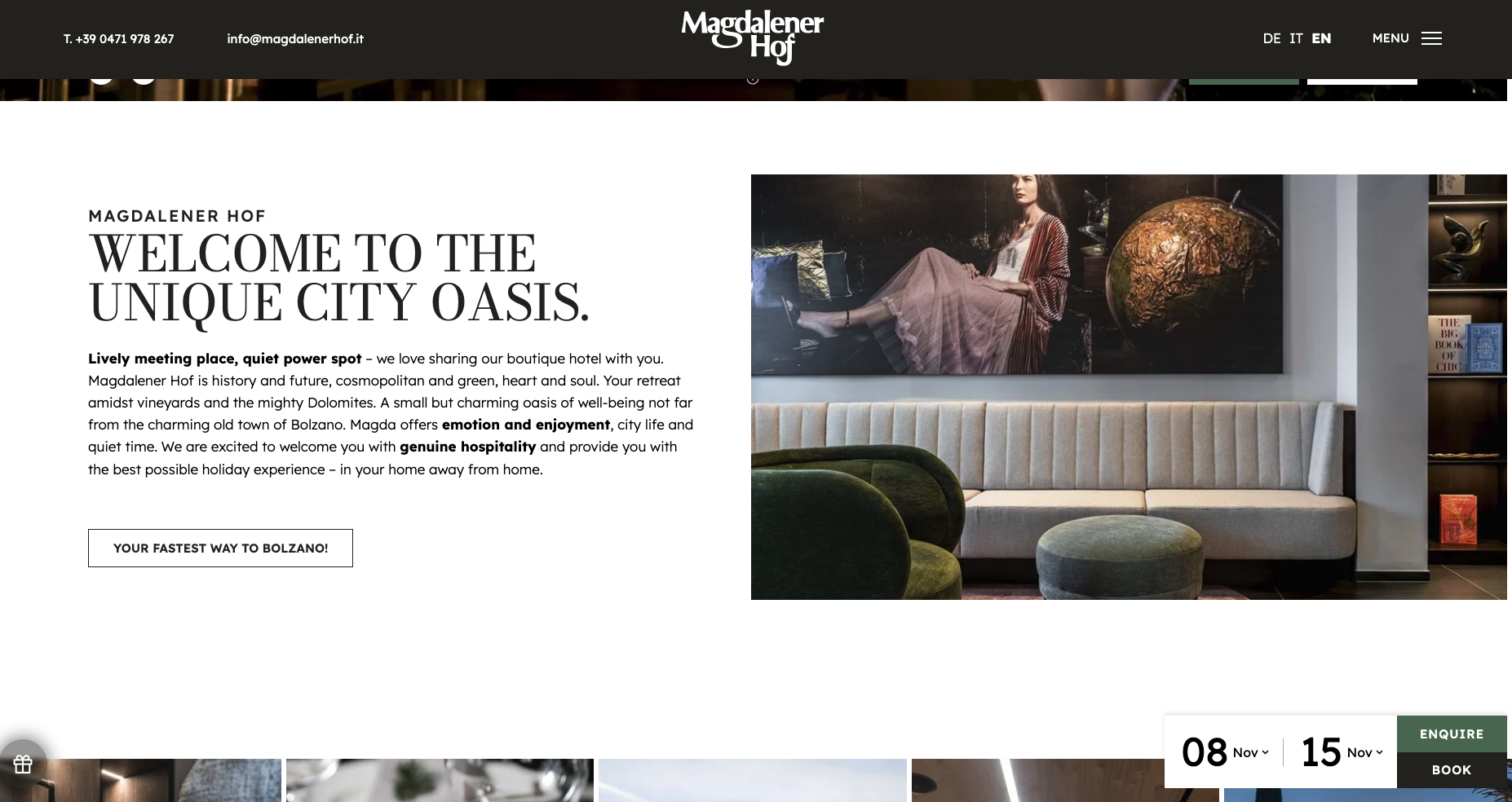
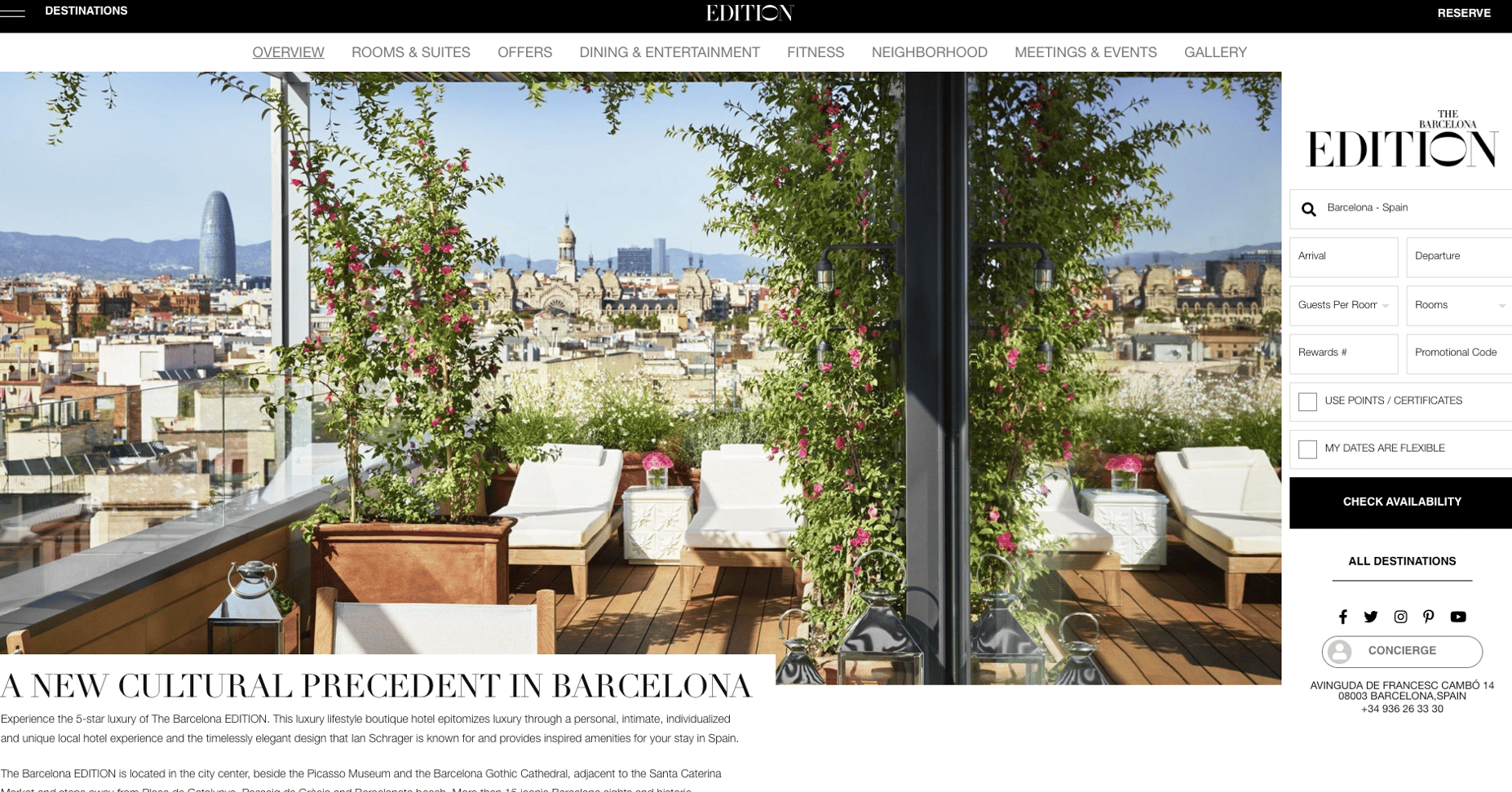
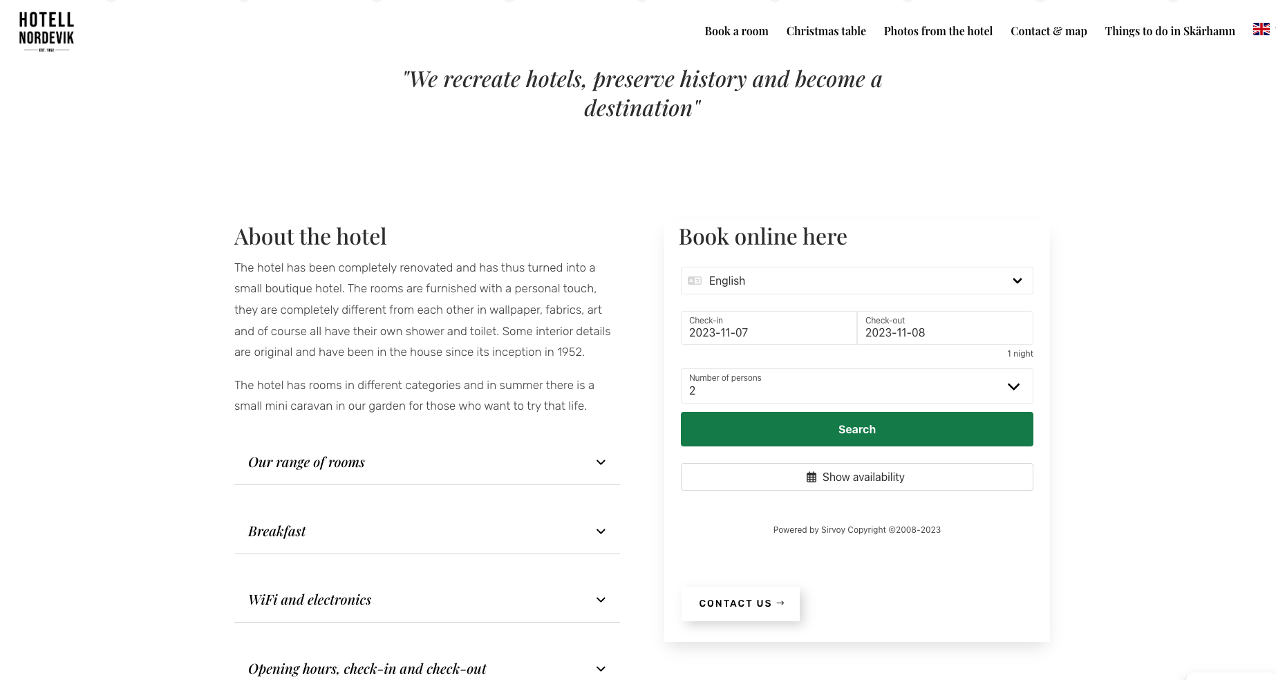
On the side, adjacent to an image, to the history of the hotel, to the rooms section, etc.
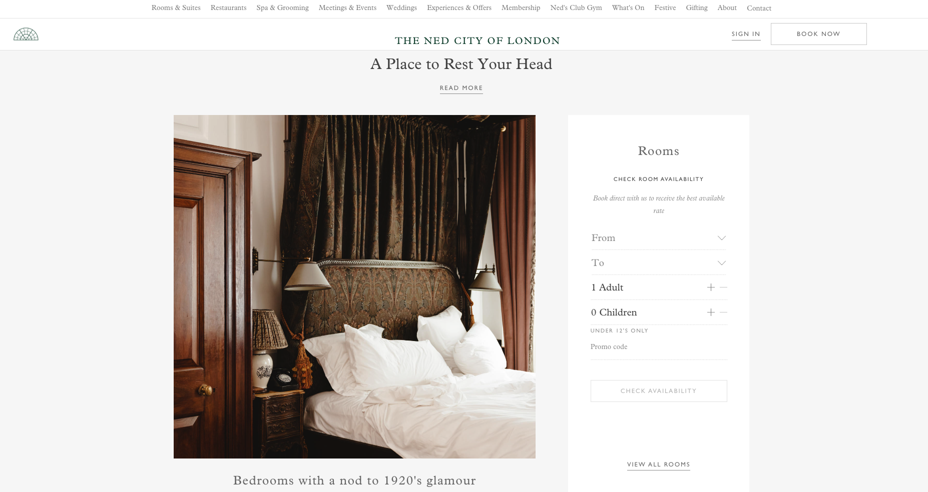
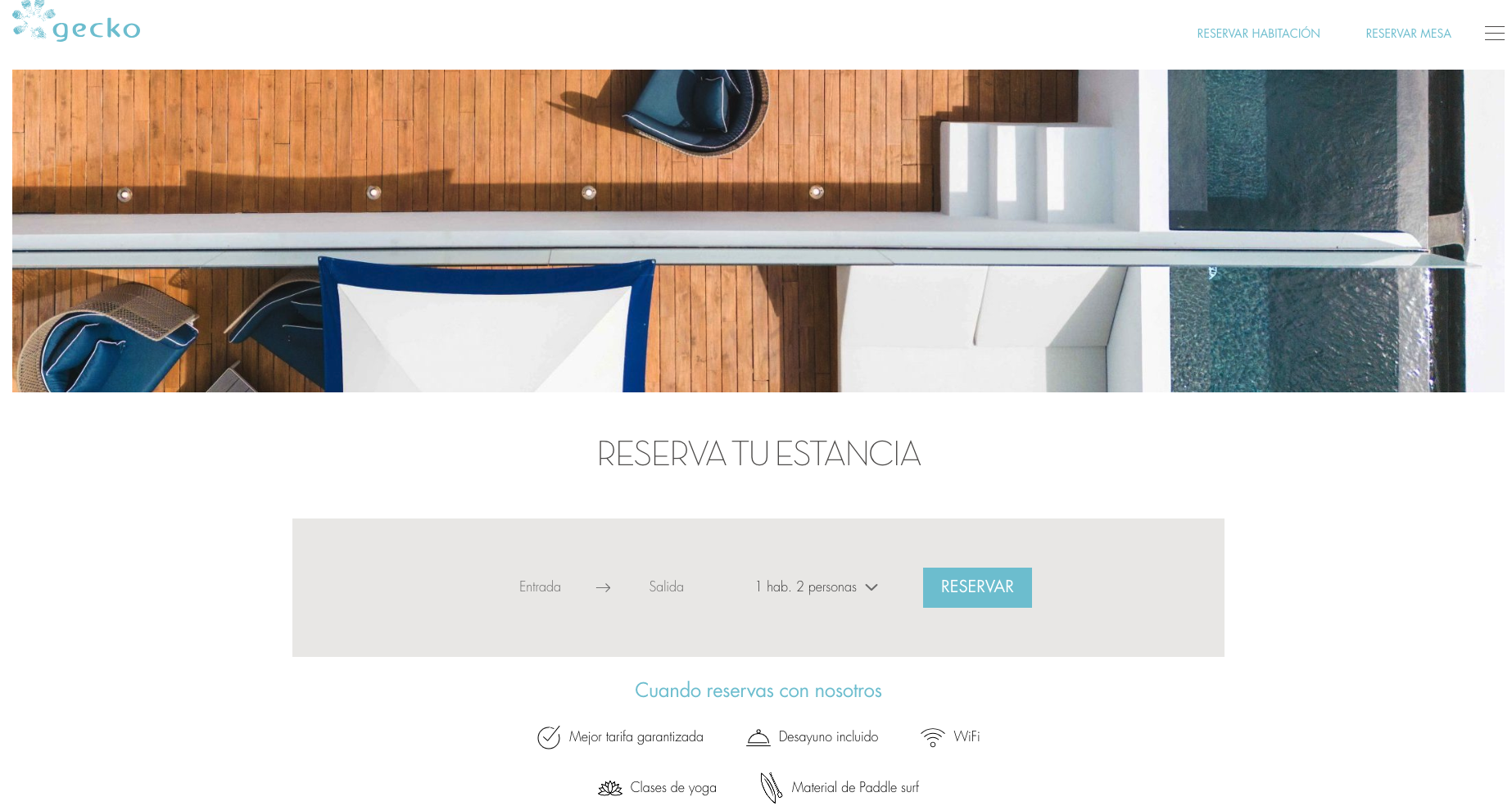
Together with the advantages of direct booking
With a call to action
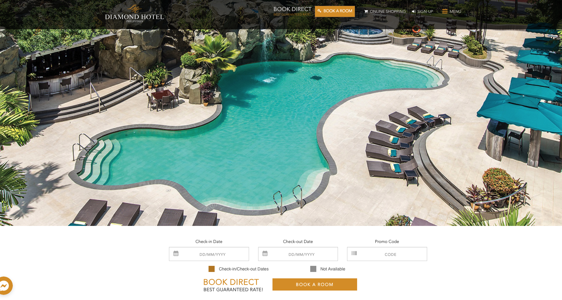
As a box that turns into a fixed booking bar in the header
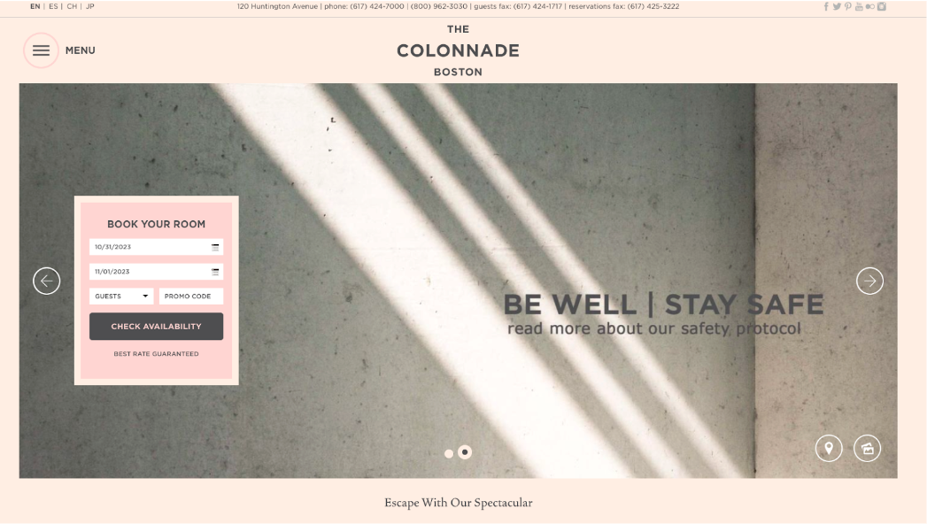
A pop-up that converts to a button

In the Room or Offer Page
At the top of the rooms page
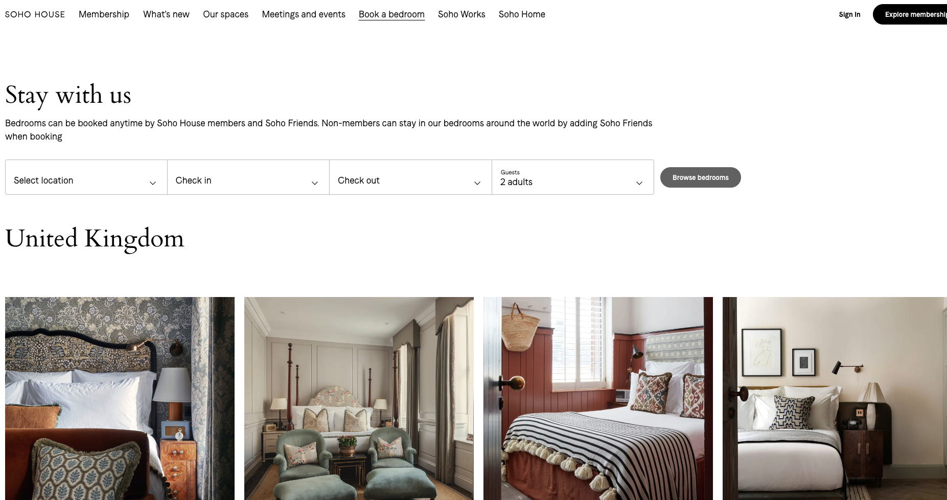
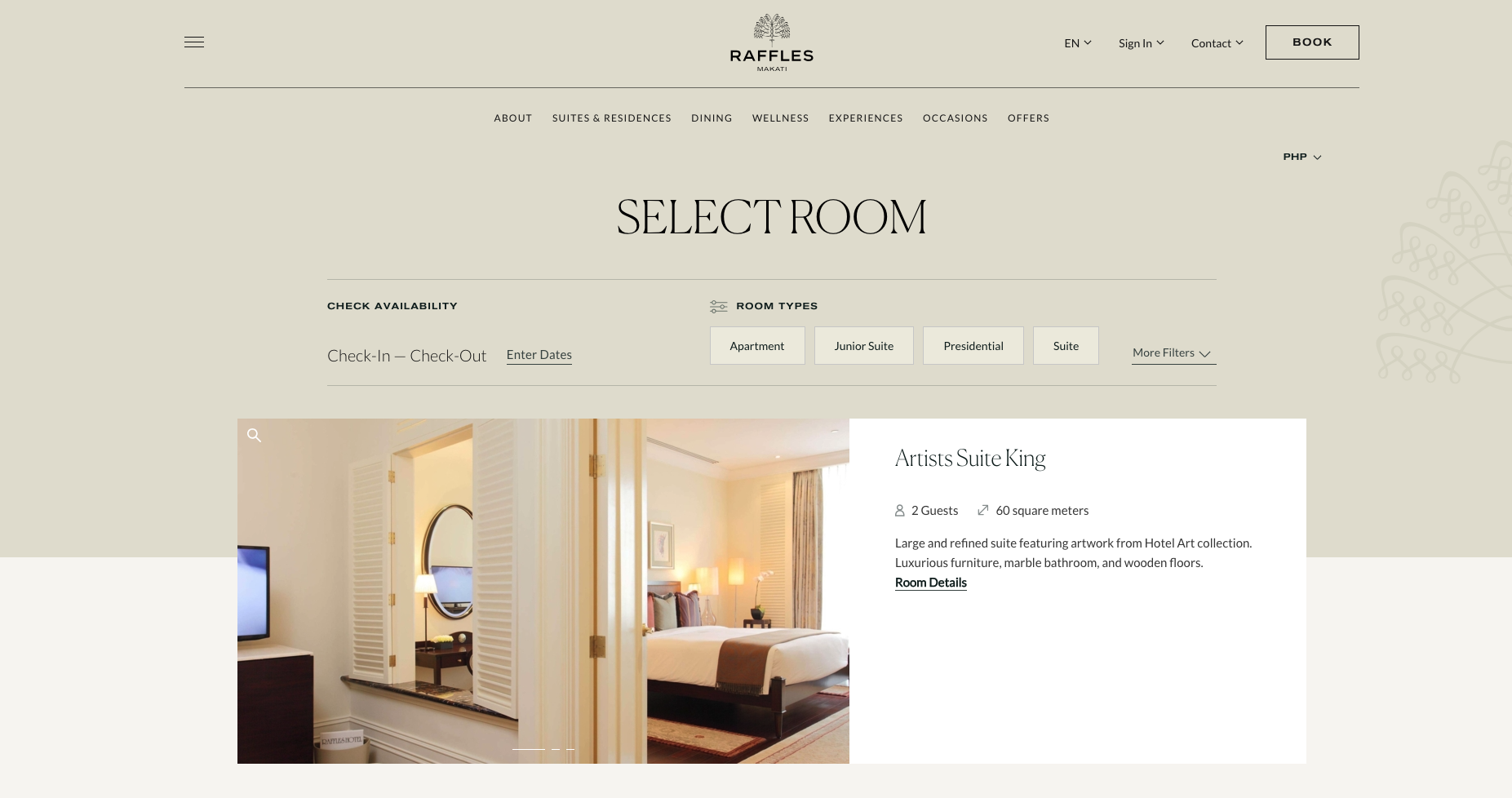
At the end of the room details page
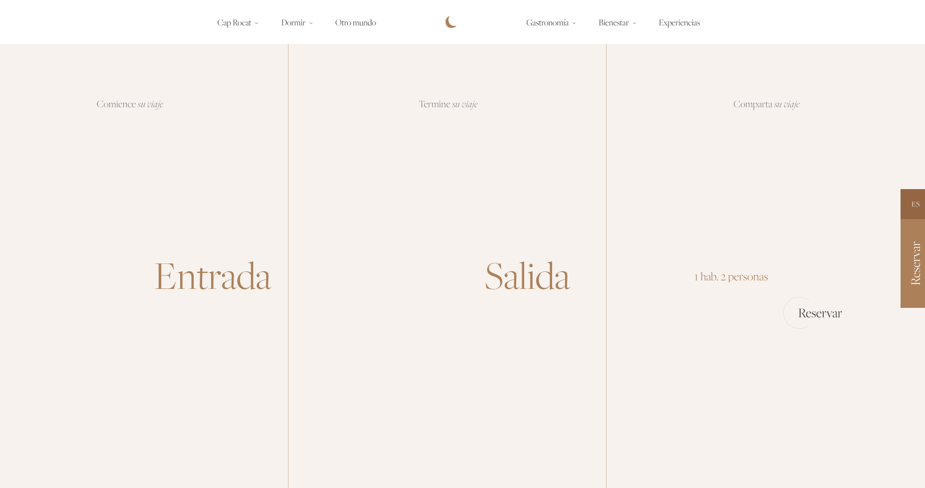
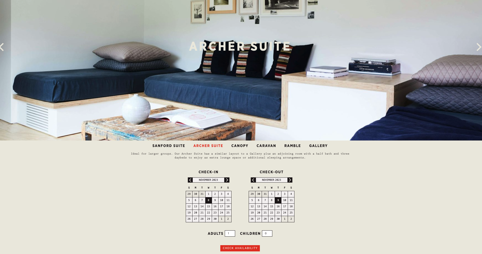
Calendar-shaped
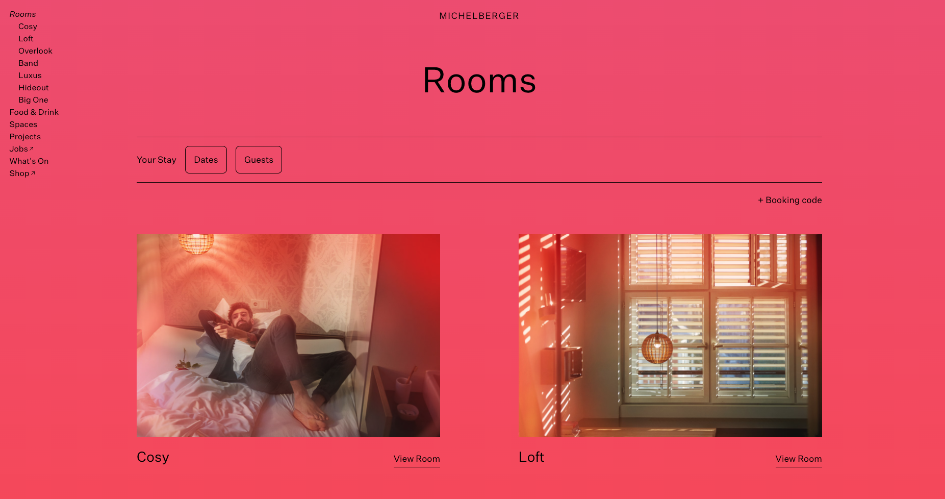
With buttons to select dates and guests
Up to this point is our selection of interesting booking bars.
Don’t lose sight of the potential of a booking mask, this powerful tool can be customized to match your website's aesthetics, ensuring a cohesive and visually pleasing experience.